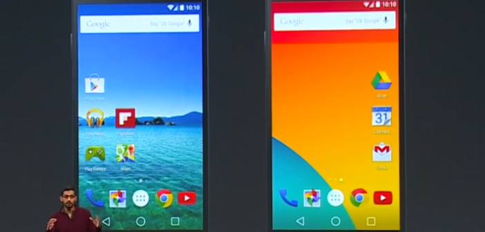
Google Inc. (NASDAQ:GOOGL)’s new Android software version 5.0, Lollipop, exhibits the biggest change yet in Android, in the past few years. The user interface design of Lollipop, Material, smartly uses grid-based layouts, transitions and whitespaces. The “cards” metaphor is extended across the Android platform.
The interface of Lollipop is designed so that it gives a consistent look and feel of all applications used on it. The new design promotes a smoother experience for Android users and decreases the learning curves of different and new apps, thereby promoting adoption of applications from third-parties. These third-party apps can be integrated with the Android app to give a smoother and more consistent feel to all users.
A style-guide has always been available to third-party app developers. These guides promote the best practices, consistent design and standard methodologies and shortcuts. When portable computing platforms were just breaking the surface, these style guides instructed the app developers to build applications whose designs were consistent with the built-in apps of the devices. This meant that when users installed new apps, they did not have to spend much time in learning each app’s usage individually. The instructions were consistent for all applications.
The Material design will now force developers to consider the user interface design of their popular apps. They will need to update their designs to the Material design in order to keep their app from looking outdated. Otherwise, the highly competitive app stores, will pull away their users and popularity.
The developers who update their designs will contribute to a refresher of Android OS. The user applications will look a lot like the built-in applications in the Android 5.0 devices. So performance of specific tasks, information flow in the apps and navigation through the app will be the same in all the applications.
Material design focuses on giving a new and updated look to the Android Platform and a feel of progress. The Material design is also forcing app developers, new and old alike, to start from square one, using the new design guides. This will keep everybody on the same page.
Over the years, Android platform has seen incremental changes in its user interface design. The applications today are developed at a slightly different level of iteration of the Android’s UI design. This generates acceptable consistency. However, this means that there is no focus on creating an app consistent with Android user experience.
Fragmentation is about creating a consistent, smooth and welcoming user experience as well as developing a code that works successfully across all the implementations of the Android OS and the hardware that implements the Android platform. Material design addresses those Android applications that drive user experience, meanwhile allowing app manufacturers to use their own environments and launchers.
Material reduces fragmentation problems. It generates shallower learning curves in new apps, thus reducing the complexity of third-party experience for users. Material design also encourages developers to roll-out updates to their apps for the new experience. This process will take some time to become widespread.


Pingback: Circle Launches Bitcoin Mobile App For Android And IOS – TechCrunch (blog) | Daily android news
Pingback: Free viagra
Pingback: cialis coupon walmart
Pingback: Canadian pharmacy viagra
Pingback: is there a generic for cialis
Pingback: viagra 50mg
Pingback: best ed pills online
Pingback: ed pills online
Pingback: cheap erectile dysfunction
Pingback: canadian online pharmacy
Pingback: canadian pharmacy
Pingback: Buy cialis
Pingback: cialis generic
Pingback: levitra price
Pingback: vardenafil 10 mg
Pingback: buy levitra online
Pingback: casino
Pingback: play for real online casino games
Pingback: natural viagra
Pingback: casino
Pingback: real online casino
Pingback: cialis pills
Pingback: cash payday
Pingback: cash advance online
Pingback: installment loans
Pingback: viagra for sale
Pingback: best real money online casinos
Pingback: cialis 5 mg
Pingback: new cialis
Pingback: what is best online blackjack
Pingback: best casino usa
Pingback: cialis internet
Pingback: cialis internet
Pingback: cialis internet
Pingback: cialis 5 mg
Pingback: marissa
Pingback: order viagra
Pingback: casinos online
Pingback: online casinos real money
Pingback: online casino gambling
Pingback: casino games online
Pingback: viagra sildenafil
Pingback: what is sildenafil
Pingback: cheap viagra online canadian pharmacy
Pingback: how to buy viagra online
Pingback: viagra samples
Pingback: cialis online pharmacy
Pingback: viagra without a doctor prescription
Pingback: buy viagra now
Pingback: cheapest generic viagra
Pingback: cialis tadalafil
Pingback: viagra for men
Pingback: generic viagra without subscription walmart
Pingback: cialis 10mg
Pingback: real online casino
Pingback: casino online slots
Pingback: buy generic viagra mastercard
Pingback: buy viagra with no prescription
Pingback: buy viagra in qatar
Pingback: hydroxychloroquine brand name
Pingback: online viagra
Pingback: generic cialis for sale
Pingback: buy viagra
Pingback: buy generic viagra
Pingback: grassfed.us
Pingback: buszcentrum.com
Pingback: cialistodo.com
Pingback: cialis online
Pingback: viagra coupons from pfizer
Pingback: keflex.webbfenix.com
Pingback: sildenafil
Pingback: sildenafil coupon
Pingback: catapres otc
Pingback: order ceclor
Pingback: how to purchase celebrex
Pingback: how to buy cephalexin 500mg
Pingback: cipro generic
Pingback: cost of claritin
Pingback: chumba casino
Pingback: online casino real money us
Pingback: casino online real money
Pingback: real casino games
Pingback: doubleu casino
Pingback: play for real online casino games
Pingback: casino online slots
Pingback: online slots real money
Pingback: best slots to play online
Pingback: nj car insurance
Pingback: car insurance price
Pingback: alliance car insurance quotes
Pingback: classic car insurance quotes
Pingback: rbc car insurance
Pingback: average car insurance
Pingback: car insurance quotes comparison sites
Pingback: insurance quote car
Pingback: hartford car insurance quotes
Pingback: auto liability insurance
Pingback: speedy cash
Pingback: payday loan definition
Pingback: payday loans tulsa
Pingback: installment loans with no credit check
Pingback: quick loans with no credit checks
Pingback: online payday loan
Pingback: Order viagra us
Pingback: online personal loan lender
Pingback: cbd oil for sale 1200 mg capsuls
Pingback: cbd oil for cancer for sale
Pingback: best way to use cbd oil for pain management
Pingback: which blood pressure meds cause ed
Pingback: cbd oil for sale vaporizer
Pingback: best cbd oil for pain and inflammation
Pingback: cbd oil for dogs with cancer
Pingback: cbd rich hemp oil benefits
Pingback: admission essay writing services
Pingback: write a persuasive essay
Pingback: essays writing
Pingback: help my essay
Pingback: buy essay
Pingback: paper writers for hire
Pingback: federalist paper writers
Pingback: american essay writing service
Pingback: help my essay
Pingback: step to write an essay
Pingback: cleocin for sale
Pingback: clomid 100 mg otc
Pingback: where to buy clonidine
Pingback: Sample viagra
Pingback: clozaril coupon
Pingback: order symbicort inhaler
Pingback: order combivent
Pingback: where to buy coreg 3,12mg
Pingback: compazine no prescription
Pingback: Get viagra fast
Pingback: coumadin generic
Pingback: order cymbalta
Pingback: where to buy dapsone 1000caps
Pingback: ddavp 0.1mg no prescription
Pingback: depakote 250 mg no prescription
Pingback: diamox uk
Pingback: differin without a prescription
Pingback: where can i buy diltiazem 30 mg
Pingback: Best viagra alternative
Pingback: doxycycline 100 mg tablet
Pingback: dramamine 50mg cheap
Pingback: elavil 25mg price
Pingback: erythromycin coupon
Pingback: etodolac 400 mg united kingdom
Pingback: where to buy flomax
Pingback: buy flonase nasal spray 50 mcg
Pingback: garcinia cambogia 100caps online
Pingback: cheap geodon 40mg
Pingback: hyzaar 12,5 mg prices
Pingback: cheapest imdur 20 mg
Pingback: imitrex canada
Pingback: imodium cost
Pingback: content
Pingback: imuran 25mg tablets
Pingback: indocin 50mg uk
Pingback: how to purchase lamisil
Pingback: levaquin otc
Pingback: lopid price
Pingback: buy lopressor
Pingback: luvox online
Pingback: how to purchase macrobid
Pingback: meclizine 25mg no prescription
Pingback: mestinon canada
Pingback: micardis united kingdom
Pingback: mobic 7,5 mg canada
Pingback: motrin 600mg pills
Pingback: nortriptyline cheap
Pingback: periactin medication
Pingback: phenergan over the counter
Pingback: plaquenil 400mg cost
Pingback: prevacid without prescription
Pingback: prilosec 40mg australia
Pingback: proair inhaler 100mcg pharmacy
Pingback: procardia 30 mg uk
Pingback: cheap protonix 20 mg
Pingback: provigil tablets
Pingback: pyridium 200 mg generic
Pingback: reglan medication
Pingback: remeron australia
Pingback: cheap retin-a cream
Pingback: revatio australia
Pingback: how to buy risperdal
Pingback: robaxin tablets
Pingback: rogaine coupon
Pingback: seroquel 200mg price
Pingback: cost of singulair
Pingback: skelaxin 400 mg canada
Pingback: cost of spiriva 9mcg
Pingback: cheap tenormin 25mg
Pingback: thorazine 50 mg online
Pingback: how to buy toprol 50 mg
Pingback: buy tricor 160 mg
Pingback: where can i buy valtrex
Pingback: vantin 200mg cost
Pingback: how to purchase verapamil 40 mg
Pingback: voltaren 100mg australia
Pingback: wellbutrin cost
Pingback: order zanaflex 2 mg
Pingback: zestril tablets
Pingback: sites
Pingback: zocor 20 mg coupon
Pingback: where to buy zovirax
Pingback: zyloprim tablet
Pingback: zyvox 600mg united states
Pingback: sildenafil without prescription
Pingback: tadalafil 80 mg online pharmacy
Pingback: furosemide 40 mg over the counter
Pingback: escitalopram for sale
Pingback: aripiprazole 20 mg price
Pingback: pioglitazone 15mg no prescription
Pingback: fexofenadine 180 mg united kingdom
Pingback: glimepiride coupon
Pingback: cheap meclizine 25 mg
Pingback: leflunomide 20mg for sale
Pingback: atomoxetine 18 mg generic
Pingback: donepezil purchase
Pingback: anastrozole otc
Pingback: irbesartan 300 mg generic
Pingback: order dutasteride 0,5 mg
Pingback: olmesartan 40mg without a doctor prescription
Pingback: clonidine 0.1mg without a prescription
Pingback: cefuroxime generic
Pingback: cost of citalopram 20 mg
Pingback: cheap cephalexin
Pingback: how to buy ciprofloxacin 250 mg
Pingback: loratadine prices
Pingback: where can i buy clindamycin
Pingback: clozapine without prescription
Pingback: prochlorperazine 5mg purchase
Pingback: carvedilol tablets
Pingback: warfarin 1mg uk
Pingback: rosuvastatin 20 mg australia
Pingback: desmopressin 0.1 mg online pharmacy
Pingback: divalproex 125 mg online pharmacy
Pingback: where can i buy trazodone 100 mg
Pingback: how to purchase tolterodine
Pingback: acetazolamide pharmacy
Pingback: fluconazole coupon
Pingback: how to purchase phenytoin 100 mg
Pingback: buy oxybutynin 2.5 mg
Pingback: doxycycline 100mg for sale
Pingback: bisacodyl purchase
Pingback: venlafaxine without prescription
Pingback: amitriptyline united kingdom
Pingback: permethrin without a doctor prescription
Pingback: acbkpnsy
Pingback: estradiol price
Pingback: how to purchase etodolac
Pingback: fluticasone mcg uk
Pingback: how long does cialis take to kick in
Pingback: wat kost cialis bij de apotheek
Pingback: nitrofurantoin without prescription
Pingback: how does ivermectin pills work
Pingback: glipizide 10mg tablet
Pingback: isosorbide 40mg united kingdom
Pingback: sumatriptan price
Pingback: venta de cialis
Pingback: loperamide 2 mg uk
Pingback: buy azathioprine
Pingback: propranolol pharmacy
Pingback: canadian generic cialis
Pingback: terbinafine uk
Pingback: digoxin 0.25 mg coupon
Pingback: hydroxychloroquine and weight loss
Pingback: augmentin 875 generic price
Pingback: buy furosemide 100 mg
Pingback: how can i get zithromax over the counter
Pingback: atorvastatin 10mg generic
Pingback: ivermectin lotion cost
Pingback: proair albuterol inhaler
Pingback: cost of gemfibrozil
Pingback: metoprolol nz
Pingback: doxycycline and pregnancy
Pingback: prednisolone suppository
Pingback: clomid and fertility
Pingback: priligy tabletas
Pingback: why take synthroid
Pingback: metoclopramide without a doctor prescription
Pingback: propecia worth it
Pingback: neurontin pills
Pingback: paxil mg
Pingback: plaquenil ra
Pingback: where to buy cialis online canada
Pingback: How do you know that he wants to kiss you buy vardenafil?
Pingback: Medications and Reproductive Health - Empowering Family Planning dapoxetine usa?
Pingback: #file_links[C:\spam\yahoo\TXTmeds.txt,1,N] #file_links[C:\spam\yahoo\ventolin.txt,1,N?
Pingback: Medications and Eye Health - Clear Vision for a Bright Future buy stromectol?
Pingback: Understanding Food Allergies and Intolerances ivermectin wormer?
Pingback: How can air quality improvements reduce the health impacts of air pollution kamagra price?
Pingback: How are high-risk pregnancies managed to ensure the safety of both mother and baby fildena 100mg?
Pingback: Medications and Immune Health - Boosting Your Body's Defense System z pack 500 mg dosage?
Pingback: Medications and Digestive Health - Restoring Balance, Easing Discomfort vidalista ct 20mg?
Pingback: Medications and Dry Eye Relief - Nurturing Ocular Comfort stromectol for scabies dosage?
Pingback: Stem Cell Therapy - Hope for Incurable Diseases plaquenil 200 mg brcl?
Pingback: Medications and Grief Counseling - Supporting Emotional Healing buy dapoxetine?
Pingback: Medications and Mental Wellness - Restoring Balance and Stability wholesale price for plaquenil?
Pingback: Can antibiotics be used to treat infections in patients with chronic kidney disease why is stromectol prescribed?
Pingback: Emerging Infectious Diseases - Global Threats and Responses dapoxetine buy geniune?
Pingback: Can antibiotics prevent infection in schoolchildren Azithromycin for chlamydia treatment?
Pingback: How did she get pregnant if pulled out stromectol over the counter cvs
Pingback: Can erectile dysfunction be a side effect of bladder surgery how to get viagra pills
Pingback: Why does a man get erect while sleeping where can i buy kamagra in australia
Pingback: Why is my albuterol inhaler not working salbutamol inhaler
Pingback: 100mg viagra pills
Pingback: What are the 4 components of quality management??
Pingback: fildena forum
Pingback: sildenafil 50mg us
Pingback: vidalista 10
Pingback: ventolin inhaler for sale
Pingback: tadalista 40mg
Pingback: buy cialis
Pingback: buy cheapest priligy
Pingback: sildenafil 100mg brand
Pingback: buy revatio online
Pingback: priligy 60
Pingback: proair digihaler how to use
Pingback: proair and albuterol
Pingback: Anonymous
Pingback: cenforce 100 nasД±l kullanД±lД±r
Pingback: plaquenil for lupus
Pingback: ivermectin guinea pigs
Pingback: pregabalin vs gabapentin cost
Pingback: Buy stromectol and ivermectin 3mg lowest price, bonus pills
Pingback: lasix generic
Pingback: advair medication
Pingback: drug advair
Pingback: advair price
Pingback: Cenforce 200 for sale
Pingback: ivermectin side effects in dogs
Pingback: dapoxetine 60 mg tablet
Pingback: vidalista 80
Pingback: Cenforce 100 vs viagra
Pingback: Cenforce 200 sildenafil citrate
Pingback: fildena double 200 mg tablets
Pingback: cenforce india price
Pingback: albuterol 90mcg inhaler
Pingback: Sildenafil Price cvs
Pingback: proscar cost
Pingback: fildena 100 mg reviews
Pingback: vardenafil side effects
Pingback: minoxidil 5mg
Pingback: Sildenafil 50 mg Tablet Cost
Pingback: seretide 250
Pingback: covimectin 12 tablet
Pingback: ivecop 12 mg tablet
Pingback: stromectol price
Pingback: covimectin 12 tablet
Pingback: iverhope 6 mg
Pingback: buy vardenafil
Pingback: clomiphene 50mg ovulation
Pingback: buy redihaler
Pingback: fake vidalista
Pingback: order clomid online
Pingback: minoxidil 5mg
Pingback: coupon for rybelsus
Pingback: rybelsus for weight loss
Pingback: is vidalista 10 generic cialis
Pingback: peridon 10 mg
Pingback: effet secondaire motilium
Pingback: buy generic levitra
Pingback: citalopram
Pingback: poxet 30
Pingback: fildena cheap
Pingback: malegra-100
Pingback: durvet duramectin equine wormer paste 12 tubes
Pingback: imrotab 6
Pingback: vermact 12 use
Pingback: stromectol pills
Pingback: vidalista 40 side effects
Pingback: vidalista 40
Pingback: super p force 160 mg
Pingback: sildigra 120
Pingback: buy fildena 50mg pill
Pingback: cenforce
Pingback: kamagra oral jelly for sale
Pingback: avanafil harga
Pingback: t olimelt 5 mg
Pingback: buy dapoxetine in usa
Pingback: kamagra india
Pingback: cenforce 100 olx
Pingback: buy amoxil
Pingback: vermovent 12
Pingback: dapoxetine 60 price
Pingback: Generic clomid for sale
Pingback: seroflo rotacaps 250
Pingback: beclomethasone dipropionate
Pingback: gout medication probenecid
Pingback: isotroin sunscreen lotion
Pingback: darunavir 800
Pingback: lipitor without prescription 5mg-80mg
Pingback: viagrabelgique.com
Pingback: pharmvolk.com
Pingback: zenegra
Pingback: timolol maleate eye drops 0.5
Pingback: forzest 20 mg tablet uses in hindi
Pingback: androgel dosing for women
Pingback: levitra prescription
Pingback: tadalafil uk
Pingback: kamagra jelly
Pingback: profcial.wordpress.com
Pingback: vidalforman.wordpress.com
Pingback: cenforce360.com
Pingback: buy p force
Pingback: tadalista 40 mg review
Pingback: cathopic.com/@poxet
Pingback: xalatan eye drops for dogs
Pingback: vigrakrs.com
Pingback: vidalista
Pingback: ventolin inhaler
Pingback: Being patient with the process is essential, as consistent improvements in sexual wellness often unfold over time with viagra connect.
Pingback: levitra commercial
Pingback: vardenafil brand name
Pingback: otcalbuterol.net
Pingback: vardenafil vs viagra
Pingback: Vidalista over datum
Pingback: ciails cost
Pingback: cialis Tadalafil 20 mg tablets
Pingback: everolimus side effects kidney
Pingback: cobra vega extra
Pingback: stromectol pills
Pingback: black cialis c800
Pingback: kamagra 50mg
Pingback: cialis vs generic tadalafil reviews
Pingback: stromectool.com
Pingback: betimol vs timolol
Pingback: buy albuterol sulfate
Pingback: about kamagra tablet
Pingback: prednisone
Pingback: cialis 5 mg oral jelly
Pingback: vilitra 40 mg vardenafil 1.2
Pingback: dapoxetine priligy
Pingback: Fildena
Pingback: amoxil price in pakistan
Pingback: dispermox 250
Pingback: iverjohn 6
Pingback: cenforce 200 mg price
Pingback: albuterolus.com
Pingback: zithromaxotc.com
Pingback: cenforcebnr.com
Pingback: viahelpmen.wordpress.com
Pingback: zithropak.com
Pingback: plaqcmd.com
Pingback: lipitorbrl.com
Pingback: cenforceindia.com
Pingback: stromectolist.com
Pingback: cenforceindian.wordpress.com
Pingback: belviagra.com
Pingback: in.pinterest.com/flagyltablet/
Pingback: community.ruckuswireless.com/t5/user/viewprofilepage/user-id/20677
Pingback: experienceleaguecommunities.adobe.com/t5/user/viewprofilepage/user-id/17880527
Pingback: manor pharmacy store locator
Pingback: hydroxychlor tab 200mg
Pingback: comprar Nolvadex en estados unidos
Pingback: imrotab 12
Pingback: buy albuterol nebulizer
Pingback: flagyl pills at clicks price
Pingback: vilitra vardenafil tablets 20 mg 1.2
Pingback: avana 50 mg
Pingback: impect 12
Pingback: cenforce safe
Pingback: Vidalista centurion
Pingback: isotretinoin rems
Pingback: walmart viagra price
Pingback: Vidalista 20mg
Pingback: priligy 90 mg
Pingback: +38 0950663759 – Volodimir (Sergiy) Romanenko, Odesa – ObItsyav robochiy noutbuk, ale posilka priyshla I tovar viyavivsya ne robochim. Poprosiv kompensatsIyu — Ignor, tse ShAHRAY. Budte oberezhnI pri pokupkah u nogo.
Pingback: dapoxetina priligy buy secure canada
Pingback: cialis oral jelly erfahrungen
Pingback: iverwon
Pingback: side effects of Sildenafil
Pingback: iverit
Pingback: ivercon
Pingback: cenforce 200mg amazon
Pingback: sunrise super p force
Pingback: loniten pills
Pingback: can i get a prescription for dapoxetine